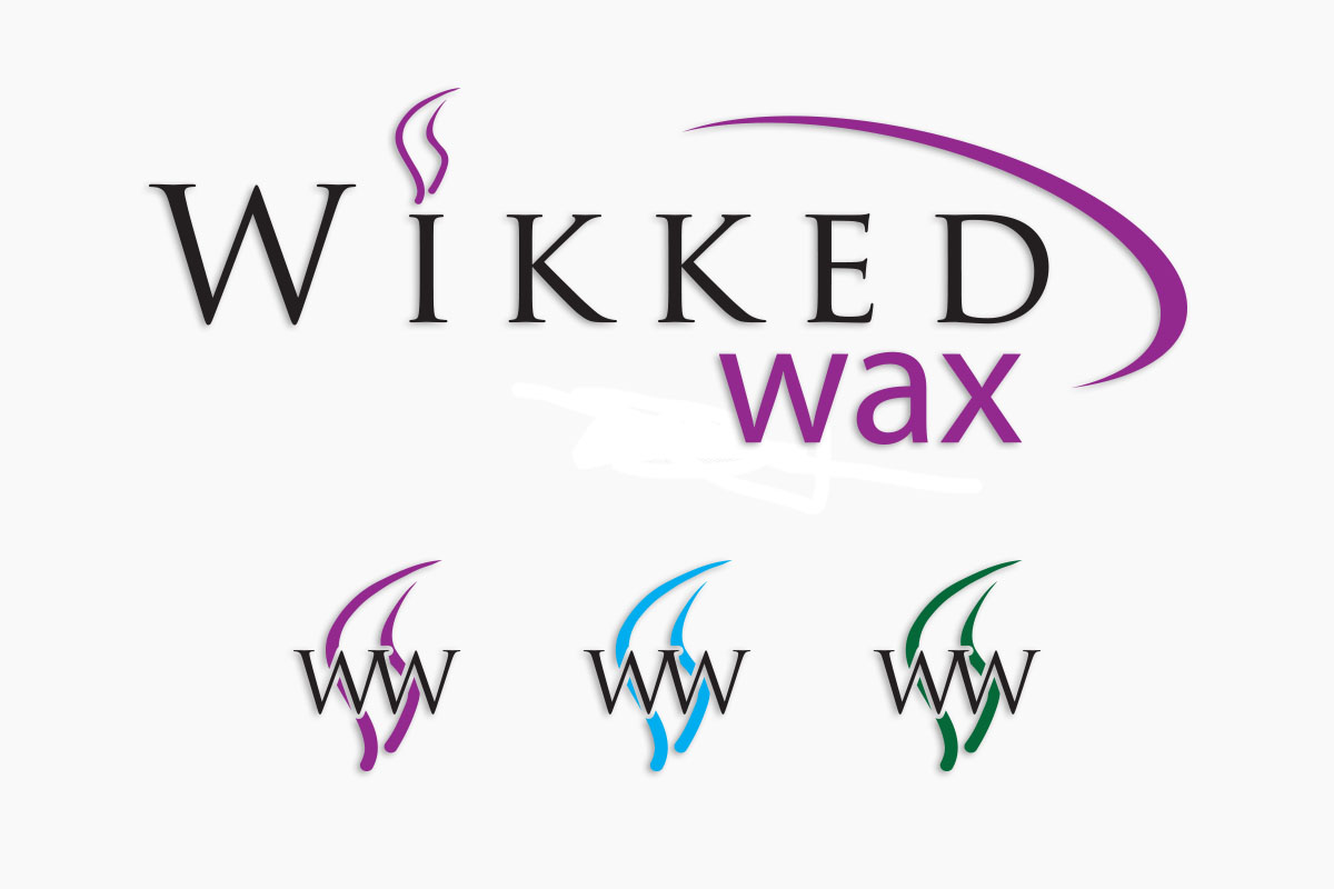
The logo plays back to the company's candle making roots, with the symbolism of a candle's flame playing heavily into the full and short forms of the logo. As the product line evolved, the logo embraced complementary colour changes to differentiate between product variations (purple - women's line; blue - men's line; green - future hemp based line).

With the product line expansion and the product's availability in commercial outlets, the need to develop distinct labels for both the Men's and Women's lines.
Again, the labels needed to be complementary and distinctly different, yet sharing the same elements tailored for both masculine and feminine products.

The final piece of the project was a full digital package, with linked social media and web pages.
The web page is full e-commerce site, with access to the full range of 900+ products. Like most web pages it is constantly growing with more and more products being continuously added.
In keeping with the 'Wikked" theme of the name, the site itself was specifically themed along sensual lines and imagery.
